Why SavannahNow's mobile website looks like an app
Why are there no headlines on the homepage of the mobile website of the Savannah Morning News? Because smartphone users tend to like to do stuff. Morris Publishing Group redesigned this mobile site to look and work more like an app.
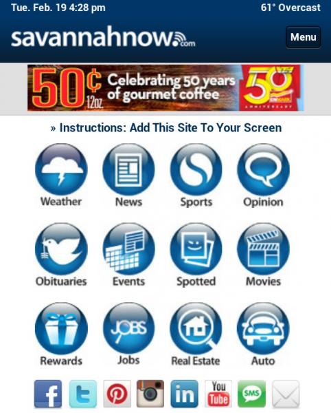
The mobile homepage of SavannahNow.com features a grid of 12 icons, each corresponding to a section of the site. Beneath that are smaller icons linking to each of the news venue's many social media presences.
...And no headlines. Not one. Users can opt to switch to the full version of the site which is a more traditional headline-laden approach, but the default mobile site looks and works more like an app.
Why? In a blog post, Morning News vice president of audience Steve Yelvington explained:
"Something had to go. Even if your phone is one of those dorky-looking five-inch phablets, it doesn't have enough display space to accommodate the mission conflict that reigns on the typical homepage: navigation, content recommendation, and commercial recommendation (advertising). So the content went -- all of it. Now navigation rules. Weather, movie listings, real estate and other features that were drowned in a cascade of news are now easy to find."
The key advantage of this approach is that it's easier for users to quickly navigate to the desired section, without scrolling down a lengthy page. Mobile users strongly desire speed of access and ease of use. So now, a SavannahNow user who wants the local weather (typically one of the highest-trafficked pages in any news site) doesn't have to plow past the sports headlines to get the forecast -- it's the first icon in the grid.
Once users click past the home page to a section, a more traditional news website layout returns.
This is a model that community information, news, and engagement project might wish to consider for their own websites. Engagement is an active process, and mobile users (especially smartphone users) tend to have a very action-focused mindset. While true "native" mobile apps (downloadable platform-specific software) are generally too costly for most community engagement projects, and true mobile "web apps" (app-like interactivity, such as a searchable database, delivered via the mobile web browser) tend to work better for niche topics, adopting an app-like design for your mobile website homepage could be a first step toward engaging your community through ease of use.
One drawback to the new SavannahNow.com home page is that, since this is not actually responsive web design but rather a separate mobile site, the cell-phone-sized app-like home page also appears to tablet users -- which is a little awkward. Yelvington's post discussed why they haven't yet adopted responsive design techniques for the site; but new community engagement projects starting from scratch may not face these hurdles.
