Election 2012: The First Data Election?
On Tuesday, October 30, the Knight Digital Media Center is offering a free online seminar, "Diving Into Data," focusing on the ways that news organizations and mission-driven organizations can use data effectively.
We're entering an explosion in the level of interest in and participation in both consuming and creating data visualizations. The web is studded with thousands of data repositories, where data is available for free downloads, and there's a burgeoning number of freely available tools to create data visualizations for the web, including tools aimed at entry-level users.
It's a wonderful time for those of us who are interested in finding new ways to express information about complex topics in a simple, visual, and shareable way. One great example of this is the huge variety of data visualizations about this year's US presidential election. Here are a few examples:
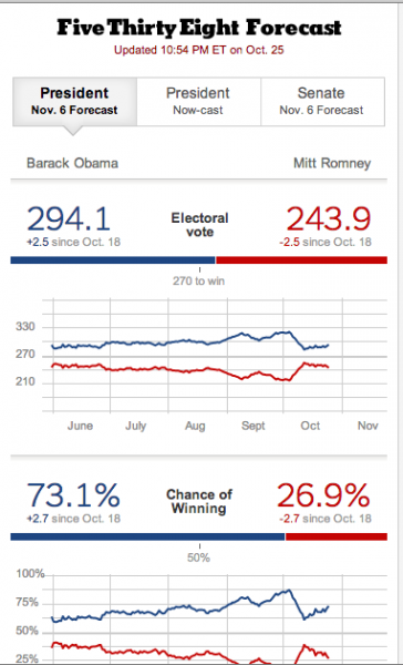
FiveThirtyEight, a blog which provides daily digests of political polling, has become the front page for many of us who are interested in this year's election. Not only does blogger Nate Silver collect the dozens of statewide and nationwide polls in the run-up to November, he also plugs the numbers into a sophisticated computer model, running tens of thousands of "simulated elections" to come up with an assessment of each candidate's chances. The "Nowcast" is the day-by-day forecast of each candidate's progress:
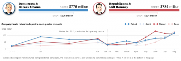
In the wake of the Supreme Court decision in the Citizens United case, there's more money than ever in this year's election, from more sources than ever. The Washington Post's Campaign Finance Explorer allows you to navigate through donor data for each campaign at a glance:
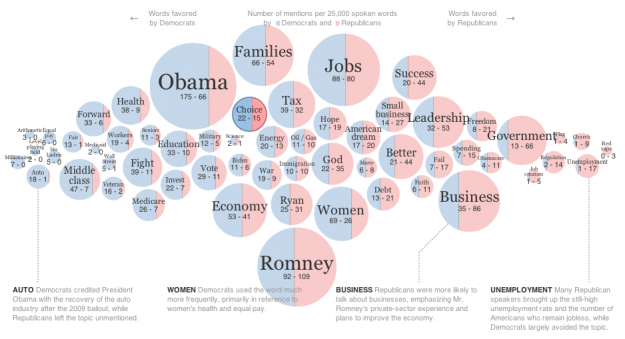
During the national conventions, news organizations mapped the multiday political talkfests, breaking down how often speakers of the two major political parties addressed major issues:
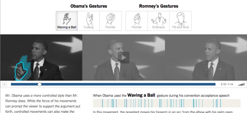
This year's presidential debates turned out to be more dramatic and consequential than anybody could have predicted, leading news geeks to produce visualizations not only of what candidates said, but even candidates' body language and characteristic hand gestures during the debates:
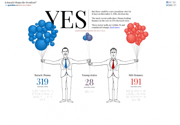
Perhaps my favorite election data visualization this year is this whimsical one from The Guardian and Real Clear Politics. It's a single data visualization with two URLs: IsMittRomneyThePresident.com and IsBarackObamaThePresident.com, and shows each candidate holding a bunch of balloons. Each balloon represents one of the US states, and the size of the balloons represents the number of Electoral College votes each state can cast. While the election hasn't been held yet, which candidate is holding a particular balloon is driven by polling data collected by Real Clear Politics.