Traffic map: Data visualization highlights local housing, jobs imbalance
Traffic congestion, jobs, and housing: Using public data to pull these important aspects of local life together on an interactive map can spark powerful community conversations about quality of life.
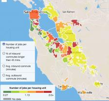
Recently, data journalist Chris Walker recently drew on Silicon Valley commuter traffic data to produce a visual, tactile sense of the region's struggle with rapid tech industry growth. The result is this interactive map, published by the Silicon Valley Business Journal.
This map lets users view and compare average inbound and outbound commute times for local communities. Plus, this map adds crucial context that affects commute times: each city's average number of jobs per housing unit, and the percentage of inbound commuters who travel for longer than 45 minutes per day. The color coding is pretty straightforward: In areas where there are more jobs than homes and commutes are longer than 45 minutes, the hue stretches to the red end of the spectrum. The cities of San Francisco and Palo Alto are natural epicenters for this traffic, with a large hub of commuters making their way there from the outlying stretch of land (a hub of commuters come from San Jose).
In their accompanying news coverage, the Silicon Valley Business Journal highlighted how this distance affected people who earn below the region's annual median income ($90,415 per household). Besides hurting quality of life, people with longer commutes also can rack up significant expenses just to get to work -- a further economic disadvantage.
The hope for mining and presenting this data is that it will provide more than a subtle push to action. The famed Bay Area tech company buses have been a controversial commuting solution, stirring economic and class tensions around the region. This map is a visual indicator of the consequences to using a city for business without being able to actively contribute to its living infrastructure.
See more of Chris Walker's data visualizations.