Mobile-friendly websites: Two books cover responsive design basics
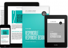
A new book, Responsible Responsive Design, will help you better understand and implement responsive web design, from programming to process. Even if you're not a web designer, this book will help you understand the mobile possibilities available to you.
Responsive web design is a key strategy for making your community website mobile-friendly -- which is more important than ever, especially for local projects.
This book, written by mobile web designer Scott Jehl and just published in November, explains what mobile really means. You'll learn how to future-proof your website -- which means, in the long run, that you'll save money on site upgrades. It covers considerations such as network speed, design-based approaches to content and screen features.
An earlier book from the same publisher (Responsive Web Design, first published in 2011 and now in its second edition) tackles this subject from a design approach and is considered a classic. Author and designer Ethan Marcotte covered the fundamentals of responsive design -- such as fluid grids (which allow content to adapt to different screen sizes), and flexible images (which allow vary in presentation when condensed). This book also offers tips for finding site support on a variety of browsers, and managing mobile website bandwidth.
wide.png)
wide.png)